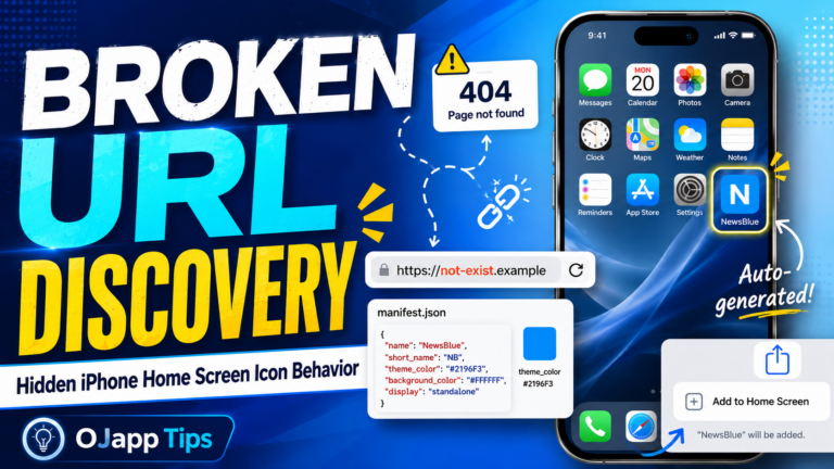
Hi, I’m Ojach. I built a feature in my test lab, “PWA LAB,” that allows me to freely change the installation URL. The goal was simple: I wanted a place to try out, in real-time, how a PWA actually looks when added to the home screen. Validating PWAs often comes down to these small, gritty experiments. Especially with maskable icons, where the differences in how Android and iOS handle cropping can change everything. Reading the spec sheet 100 times can’t compare to the moment you break your own code on a real device and finally “get it.” Every developer has been there. That’s exactly what happened this time. To be honest, it was just a simple URL typo. But that “oops” moment led me to discover some fascinating, undocumented behaviors regarding iPhone home screen icons. I just had to share this. Validating the “Broken State” The setup was incredibly simple. I used my PWA LAB to intentionally set an “invalid, non-existent URL” as the installation target. Then, I hit “Add to Home Screen” on both Android (Chrome) and iPhone (Safari) […]