
This site uses the original WordPress plugin OJapp PWA Marketing.
Each article can be added to your Home Screen with its own dedicated icon.
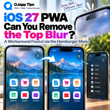
When I open a PWA from the home screen on iOS 27, a large blurred area can appear across the top of the screen.
It is not limited to the status bar containing the clock, signal, and battery indicators. The blur can extend farther down into the header, making logos, buttons, and other content underneath look blurred.
This is not a blur created by the web page itself. It is a system-level visual effect being drawn over the top of the PWA by iOS.
That means normal CSS such as backdrop-filter: none does not remove it.
While testing the behavior on a real iPhone, however, I noticed something unexpected: opening and closing a hamburger menu made the blur disappear.
That observation led to an experiment: could I reproduce whatever the drawer menu was doing without actually showing a menu?
Important: This article documents experimental behavior observed in an iOS 27 environment. It is not an official Apple API or recommended WebKit technique, and an OS update may change the behavior at any time.
- 1 First I tried Reduce Transparency
- 2 The old iOS status bar meta did not solve it either
- 3 Then Search Console made the blur disappear
- 4 I looked at the menu CSS
- 5 A nearly transparent cover only worked temporarily
- 6 Sliding a fixed panel reproduced the effect
- 7 The interesting part was keeping the panel alive
- 8 What might be happening?
- 9 This is not an official solution
- 10 This is exactly why real-device PWA testing matters
- 11 A fixed-panel transition removed the iOS 27 PWA top blur in my test
- 12 Update: Removing the Blur Without JavaScript
First I tried Reduce Transparency
iPhone has an accessibility option under:
Settings → Accessibility → Display & Text Size → Reduce Transparency
When I enabled it, the large blur at the top of the PWA disappeared and was replaced by a mostly solid background.
That was a useful clue. It confirmed that the effect was related to iOS system rendering rather than a CSS blur inside my page.
But a website cannot force the user to enable an accessibility preference.
Features such as prefers-reduced-transparency can respond to a user’s preference. They do not allow a website to change that preference.
The old iOS status bar meta did not solve it either
Next I tested the iOS-specific status bar meta used by home screen web applications.
<meta name='apple-mobile-web-app-status-bar-style' content='default'>A value such as black-translucent can affect status bar presentation, but setting it to default did not remove the large blur I was seeing.
This appeared to be related to the broader PWA rendering behavior in iOS 27 rather than simply the basic status bar style.
 PWAs Can Do This: How to Add User-Specific Pages to the Home Screen
Then Search Console made the blur disappear
The turning point came while I was using Google Search Console from the iPhone home screen.
The blur was visible immediately after launch. Then I opened the drawer menu on the left.
The blur disappeared.
Even more interestingly, it stayed gone after I closed the menu.
At first I thought this might be specific to Search Console, so I tried the same thing with OJapp Tips, which runs on WordPress.
The same kind of behavior appeared there too.
OJapp Tips displays a semi-transparent dark cover over the page while its hamburger menu is open. After closing the menu, the page returns to normal, but the iOS status bar area remains as a light solid-looking background instead of returning to the wider live blur.
That suggested the fixed layers or animation used by the drawer menu might be changing the rendering state at the top of the PWA.
I looked at the menu CSS
The WordPress theme used by OJapp Tips implements its background cover and drawer roughly like this:
.menuBtn__unshown {
  display: none;
  background: rgba(0, 0, 0, 0.5);
  position: fixed;
  inset: 0;
  z-index: 999999;
  animation: fade 0.3s;
}

.menuBtn__checkbox:checked ~ .menuBtn__unshown {
  display: block;
}

.menuBtn__content {
  position: fixed;
  top: 0;
  right: 0;
  bottom: 0;
  width: 90%;
  height: 100%;
  transform: translateX(110%);
  transition: 0.3s;
}

.menuBtn__checkbox:checked ~ .menuBtn__content {
  transform: translateX(0%);
}
Three details stood out:
- a full-screen
position: fixedcover - a fixed panel moved on and off screen with
transform - the panel remains in the document after closing and is simply moved outside the viewport
So I started reproducing those pieces separately.
A nearly transparent cover only worked temporarily
My first idea was to briefly display an almost transparent full-screen fixed element.
position: fixed;
inset: 0;
background: rgba(255, 255, 255, 0.01);
This produced an interesting result.
While the cover was present, the blur disappeared.
But as soon as I removed the cover, the original blur returned.
I also tried leaving the cover in place, but the cover alone did not reliably maintain the result.
So simply having a transparent fixed element was not enough.
Sliding a fixed panel reproduced the effect
Next I recreated the movement of the actual hamburger menu.
A fixed panel moves into the viewport and then back outside it. Its background is almost transparent, and pointer-events: none prevents it from interfering with interaction.
<style>
#ojapp-blur-cover {
  display: none;
  position: fixed;
  inset: 0;
  z-index: 2147483646;
  background: rgba(255, 255, 255, 0.01);
  pointer-events: none;
  animation: ojapp-cover-fade 0.3s;
}

#ojapp-blur-panel {
  position: fixed;
  top: 0;
  right: 0;
  bottom: 0;
  width: 90%;
  height: 100%;
  z-index: 2147483647;
  background: rgba(255, 255, 255, 0.01);
  pointer-events: none;
  transform: translateX(110%);
  transition: transform 0.3s;
}

@keyframes ojapp-cover-fade {
  from { opacity: 0; }
  to   { opacity: 1; }
}
</style>

<script>
window.addEventListener('load', () => {
  const isStandalone =
    matchMedia('(display-mode: standalone)').matches ||
    navigator.standalone === true;

  const isIOS = /iPhone|iPad|iPod/.test(navigator.userAgent);

  if (!isStandalone || !isIOS) return;

  const cover = document.createElement('div');
  cover.id = 'ojapp-blur-cover';

  const panel = document.createElement('div');
  panel.id = 'ojapp-blur-panel';

  document.body.append(cover, panel);

  void panel.offsetWidth;

  requestAnimationFrame(() => {
    cover.style.display = 'block';
    panel.style.transform = 'translateX(0%)';

    setTimeout(() => {
      cover.style.display = 'none';
      panel.style.transform = 'translateX(110%)';

      // Keep the panel outside the viewport instead of removing it
    }, 500);
  });
});
</script>
When I ran this inside the PWA, the wide iOS blur disappeared even though no visible menu was being shown to the user.
The clock, signal, and battery area remained, but its background became a light solid-looking area instead of broadly blurring the logo and content underneath.
The interesting part was keeping the panel alive
One detail turned out to matter in this experiment.
After moving the panel, I did not delete the element.
I moved it back outside the viewport:
transform: translateX(110%);Nothing is visibly covering the page, and pointer-events: none prevents the element from intercepting taps.
But in my test environment, leaving that off-screen panel in the document kept the top area in its changed rendering state.
What might be happening?
I have not inspected WebKit’s internal implementation, so I cannot claim an exact cause.
Based on the experiment, one possible sequence is:
- iOS 27 draws a system-level blur over the top of the PWA.
- Moving the fixed panel changes WebKit’s compositing layers.
- During that transition, the live top blur changes to a solid-looking background.
- Leaving the panel off-screen keeps that rendering state active.
The important point is that the page is not changing the iPhone’s accessibility settings and is not controlling the status bar through a dedicated API.
A change inside the web page’s compositing structure appears to trigger a different result in the surrounding iOS rendering.
This is not an official solution
This workaround is experimental behavior observed in a specific iOS 27 environment.
- An OS update may break it without warning.
- Results may differ between devices or iOS versions.
- Leaving transparent fixed layers in the document may have rendering costs.
- The layers could conflict with other fixed UI, drawers, or modals.
- This is not a documented Apple mechanism for controlling the PWA status area.
For that reason, I would not automatically add this workaround to every PWA.
It makes more sense as an experiment for sites where the large top blur is actually causing a UI problem.
This is exactly why real-device PWA testing matters
I did not find this behavior in a specification or a WebKit document.
I found it because I happened to open a drawer menu while using Search Console from the home screen.
That led to another test on OJapp Tips, then to isolating the CSS, testing a transparent cover, reproducing the fixed panel movement, and finally getting the same result without displaying the hamburger menu itself.
PWA behavior is not determined by the Manifest alone.
Especially on iPhone, there are behaviors that only become visible when the OS, WebKit, standalone mode, and the page’s own UI all interact.
A fixed-panel transition removed the iOS 27 PWA top blur in my test
In this experiment, I was able to remove the wide blur at the top of an iOS 27 PWA by manipulating a fixed panel inside the web page.
Changing background colors or status bar meta settings did not solve it, and a transparent full-screen cover only removed the blur temporarily.
But recreating the hamburger menu’s fixed-panel slide-in and slide-out behavior, then leaving that panel outside the viewport, kept the blur from returning in my test environment.
This is not an official way to control iOS PWA rendering, but it is a useful example of how the appearance of a PWA can depend on the OS and WebKit compositing behavior, not only on the Manifest or page CSS.
And once again, this was something I only found by actually launching the PWA from the home screen and testing it on a real device.
Update: Removing the Blur Without JavaScript
In the original version of this article, I introduced a JavaScript-based workaround. Later, I found that there are also ways to handle the blur using CSS alone.
I had already been experimenting with similar ideas myself, so I was actually pretty close to finding it too. 😅
Method 1: Extend the header into the safe area
I also tried another approach that someone suggested in a Reddit comment.
header {
  position: sticky;
  top: 0;
  background-color: #ffffff;
  padding-top: env(safe-area-inset-top);
}
This also removed the blur at the top of the PWA in my iOS 27 test.
The idea is simple: make the header sticky at the top of the screen, then use env(safe-area-inset-top) to extend its background into the safe area.
No extra HTML element is required, so if your site already uses a sticky header, this may be the simplest approach.
There is one thing to keep in mind. In the example above, the background is fixed to #ffffff. If your site uses dark mode or changes the header color while scrolling, you will need to adjust the background to match your design.
Method 2: Add a dedicated element at the top
If you do not want to modify the existing header, another option is to add a small fixed element at the top of the page.
<!-- HTML -->
<div class="remove-blur" aria-hidden="true"></div>
Then place that element at the top only when the page is running in standalone mode.
/* CSS */
@media (display-mode: standalone) {
  .remove-blur {
    position: fixed;
    inset: 0 0 auto;
    height: 11px;
    pointer-events: none;
    background: #fff;
    -webkit-background-clip: text;
    background-clip: text;
  }
}
This approach also works without JavaScript.
After testing several variations, having a painted element at the very top of the screen seems to be one of the key factors in making the blur disappear.
This may also help explain the strange behavior I found earlier, where opening and closing a hamburger menu temporarily removed the blur.
But I wanted to keep the app-like appearance
Simply making the top area white can solve the blur problem.
However, my page uses a dark design immediately after launch. Making only the top strip white felt disconnected from the rest of the interface and reduced the app-like appearance.
So I modified the idea slightly: the top strip starts black and gradually changes to white as the user scrolls.
The HTML stays the same.
<!-- HTML -->
<div class="remove-blur" aria-hidden="true"></div>
In the CSS, I define separate colors for the initial state and the state after scrolling.
/* CSS */
:root {
  --status-top: #000;          /* Color immediately after launch */
  --status-after-scroll: #fff; /* Color after scrolling */
}

@media (display-mode: standalone) {
  .remove-blur {
    position: fixed;
    inset: 0 0 auto;
    height: 11px;
    pointer-events: none;
    background-color: var(--status-top);
    -webkit-background-clip: text;
    background-clip: text;
  }
}
JavaScript then reads the scroll position and gradually interpolates between the two colors.
/* JavaScript */
(() => {
  const standalone =
    matchMedia("(display-mode: standalone)").matches ||
    navigator.standalone === true;

  if (!standalone) return;

  const strip = document.querySelector(".remove-blur");
  if (!strip) return;

  const readColor = (name) => {
    const value = getComputedStyle(document.documentElement)
      .getPropertyValue(name).trim().replace("#", "");

    const hex = value.length === 3
      ? [...value].map((c) => c + c).join("")
      : value;

    return [
      parseInt(hex.slice(0, 2), 16),
      parseInt(hex.slice(2, 4), 16),
      parseInt(hex.slice(4, 6), 16)
    ];
  };

  const top = readColor("--status-top");
  const after = readColor("--status-after-scroll");

  // The final color is reached after scrolling this distance
  const changeDistance = 150;

  function update() {
    const progress = Math.min((scrollY + 12) / changeDistance, 1);

    const rgb = top.map((value, i) =>
      Math.round(value + (after[i] - value) * progress)
    );

    strip.style.backgroundColor = `rgb(${rgb.join(",")})`;
  }

  update();
  addEventListener("scroll", update, { passive: true });
})();
This keeps the top area visually consistent with the page immediately after launch, while gradually transitioning it to the normal background color as the user scrolls.
So there are now a few practical options. If your site already has a fixed or sticky header, extending the header into the safe area is probably the simplest approach. If you do not want to modify the header, you can add a dedicated fixed element with CSS.
And if your design uses different colors depending on the scroll position or theme, adding a small amount of JavaScript gives you more control over how the top area behaves.
References
I also referred to the following articles while testing the CSS-based approaches described above.
Add OJapp Tips as a preferred source on Google
Make it easier to find OJapp Tips articles in Google Search.