Hi, I’m Ojach.
I built a feature in my test lab, “PWA LAB,” that allows me to freely change the installation URL. The goal was simple: I wanted a place to try out, in real-time, how a PWA actually looks when added to the home screen.
Validating PWAs often comes down to these small, gritty experiments. Especially with maskable icons, where the differences in how Android and iOS handle cropping can change everything.
Reading the spec sheet 100 times can’t compare to the moment you break your own code on a real device and finally “get it.” Every developer has been there.
That’s exactly what happened this time.
To be honest, it was just a simple URL typo. But that “oops” moment led me to discover some fascinating, undocumented behaviors regarding iPhone home screen icons. I just had to share this.
- 1 Validating the “Broken State”
- 2 【Android】 Chrome: The Strict Disciplinarian
- 3 【iPhone】 Safari: The Over-the-Top Concierge
- 4 Philosophy Clash: Android Builds Apps, iPhone Places Objects
- 5 【Note】 Don’t skip your icons just yet! (lol)
- 6 Related articles
- 7 Summary: There’s a world you can only see by “breaking” things
Validating the “Broken State”
The setup was incredibly simple. I used my PWA LAB to intentionally set an “invalid, non-existent URL” as the installation target. Then, I hit “Add to Home Screen” on both Android (Chrome) and iPhone (Safari) to see what would happen.
I was curious about a few things:
– Can you even add a non-existent URL to the home screen?
– How does the OS handle it when the icon image returns a 404?
– How much of manifest.json is ignored versus respected?
– What does this reveal about the underlying philosophy of each OS?
When you intentionally break things, the OS’s fallback mechanisms—usually hidden behind the scenes—are laid bare.
【Android】 Chrome: The Strict Disciplinarian
As expected, Android (Chrome) completely shut me out. It wouldn’t even let me press the “Install” button. It essentially said, “This isn’t a valid app, so beat it.”
It’s a perfectly sound and correct behavior. If it’s going to be a PWA on the home screen, the launch URL must work. Android Chrome’s validation is rigorous.
In Android’s “mind,” it’s a simple logic: “This URL won’t launch as an app, so it doesn’t deserve PWA status. Rejected.” It’s a very Google-like approach—treating the Web as a foundation to be elevated into “real” native-like experiences.
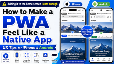
👉 Shortcut Method vs OJapp: Which Is the Best Way to Add Custom Icons to Your iPhone Home Screen?
【iPhone】 Safari: The Over-the-Top Concierge
Now, the iPhone (Safari). This is where things got really interesting.
To my surprise, the iPhone let me “Add to Home Screen” without a hitch, even with an invalid URL. It didn’t have any of the cold refusal you see on Android.
Of course, the icon image (PNG) returned a 404. But here’s the kicker: The iPhone immediately auto-generated a “placeholder icon” on the fly and made it look like a real app.
Observing this logic led to three surprising discoveries:
1. theme_color was actually alive
Frontend developers know the pain: theme_color in manifest.json often feels like a “dead” property on iOS. On Android, it smoothly paints the toolbar and headers, which is satisfying. But on iOS, it’s rarely felt.
However, since my icon image was missing, I saw the “backdoor” Apple prepared. The background color of the auto-generated icon was dyed in the color I specified in theme_color.
- Red
theme_color-> Reddish background. - Blue
theme_color-> Bluish background.
Because we usually set 100% custom icons, we never notice this. When the icon is lost, iPhone digs up the theme_color and uses it as a “seat cushion” for the background. I was honestly impressed: “So that’s where you were working!”
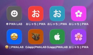
2. The Apple-style “Initial Character” Fallback
Next is how it handles text. When there’s no icon, the iPhone automatically extracts the first character of the site title and centers it in the icon.
If the title is “Ojach’s Blog,” it displays a beautifully rendered character in the center, like this:
お
It actually looks quite stylish—like a minimalist app logo. It shows Apple’s pride (or obsession) to not let the home screen be cluttered with ugly “NO IMAGE” icons.
3. The “Emoji-as-an-App-Icon” Hack
Experimenting further, I found something even better. If you put an emoji at the beginning of your site title, the iPhone will use that as the app icon.
If you name your site:
😀 PWA LAB
The home screen icon becomes:
😀
It works flawlessly with transparency and looks great. I spent way too much time trying to figure out which emoji made the best app icon. You get these unexpected gems when you mess around with real devices.
Philosophy Clash: Android Builds Apps, iPhone Places Objects
Looking at these differences, the contrast in philosophy is striking:
| OS | Handling Invalid URLs | Icon Missing | Core Philosophy |
|---|---|---|---|
| Android | Blocks addition (Error) | Cannot install | “Elevate Web to a strict App.” |
| iPhone | Forces it onto home screen | Auto-generates nicely | “Decorate Web pages as home screen pieces.” |
Android is logical; if the structure is broken, it’s not an app.
iPhone is emotional; even if the link is dead, it prioritizes keeping the user’s home screen beautiful and forced it into a usable object.
【Note】 Don’t skip your icons just yet! (lol)
While this was a fascinating discovery, please don’t use this as an excuse to stop designing icons! In production, you absolutely should provide your own assets.
Especially on iOS, apple-touch-icon caching is aggressive, so you need to stick to the standard implementation. On Android, providing a 512×512 PNG with any maskable support in manifest.json is still the gold standard.
This auto-generation is just an “insurance policy” from Apple to keep things looking good in case of an emergency. Don’t rely on it as your primary strategy.
Related articles
For the basic manifest.json settings needed for PWAs, read The Basic manifest.json Settings Required for a PWA: What Works on iPhone and Android Based on Testing.
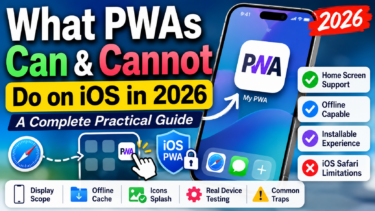
For what PWAs can do on iPhone, What PWAs Can and Cannot Do on iOS in 2026 is also useful.
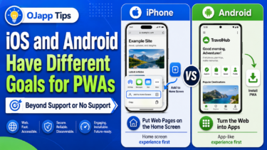
For the difference in PWA thinking between iPhone and Android, read iOS and Android Have Different Goals for PWAs.
Summary: There’s a world you can only see by “breaking” things
It’s easy to stick to the textbook implementations. But by seeing how the OS desperately tries to “take care” of your broken code, you catch glimpses of the hidden polish and thoughtfulness put in by the engineers at Apple and Google.
This experiment, born from a simple typo, taught me two things:
1. iPhone will go to great lengths to ensure your home screen looks clean, even without an icon.
2. theme_color, which I thought was dead on iOS, is actually doing heavy lifting in the background.
“PWA LAB” is incredibly fun precisely because it lets me run these “buggy experiments” without consequences.
If you’re tired of implementing by the book, try deleting your PWA icon settings and see what kind of “hospitality icon” your iPhone generates for you. You’ll likely be pleasantly surprised.