- 1 Is display: fullscreen Practical for PWAs? Comparing iPhone and Android Behavior
- 1.1 What is display?
- 1.2 On Android, it really feels more like an app
- 1.3 On iPhone, I barely noticed any change
- 1.4 How it differs from standalone
- 1.5 When fullscreen is a good fit
- 1.6 When fullscreen is not a good fit
- 1.7 What I felt after testing minimal-ui and browser
- 1.8 What I learned from testing
- 1.9 Conclusion: standalone is the practical default, fullscreen is useful for Android-focused cases
- 1.10 Related articles
- 1.11 Summary
Is display: fullscreen Practical for PWAs? Comparing iPhone and Android Behavior
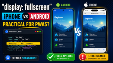
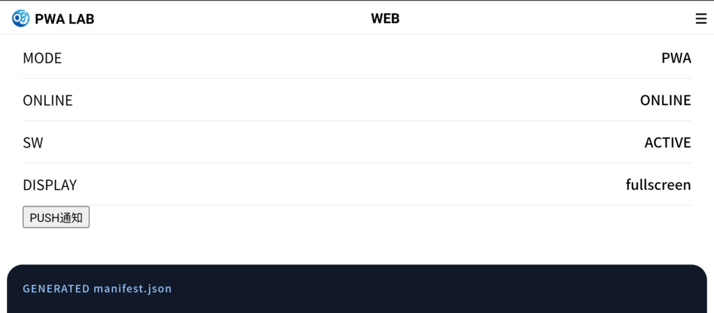
In a PWA manifest, there is a setting called display.
This setting controls how the PWA appears when it is opened from the home screen.
The most common value is usually standalone, but there is also a value called fullscreen.
Just from the name, it sounds powerful.
If the browser UI disappears and the page looks completely like an app, it sounds perfect for a PWA.
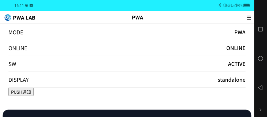
But after testing it in PWA LAB, I found a pretty realistic difference between platforms.
In short: on Android, it can feel very app-like. On iPhone, you should not expect much from it.
What is display?
display is the display mode setting inside manifest.json.
For example, you can write it like this:
{
 "name": "OJapp PWA LAB",
 "start_url": ".",
 "display": "fullscreen",
 "background_color": "#f5f7fb",
 "theme_color": "#2dd7ff"
}
Changing this display value changes how the PWA looks when opened.
The main values are:
standalone: the standard app-like PWA displayfullscreen: displays the app as full-screen as possibleminimal-ui: keeps a minimal browser UIbrowser: opens like a normal browser page
This time, I mainly tested fullscreen.
On Android, it really feels more like an app
When I tested display: fullscreen in Android Chrome, the difference was easy to see.
With normal standalone, some PWA-like top bar or system UI can remain visible.
But with fullscreen, that area mostly disappears, and the whole screen feels much more like an app surface.
Honestly, it feels pretty good.
For games, demo pages, visual presentations, vertical tools, or web apps that need a wide operation area, fullscreen can make sense.
If I only looked at Android, I would almost think, “This is enough.”
👉 Shortcut Method vs OJapp: Which Is the Best Way to Add Custom Icons to Your iPhone Home Screen?
On iPhone, I barely noticed any change
On iPhone, though, there was almost no visible change.
Even when I set display: fullscreen, I did not get the obvious full-screen effect that I saw on Android.
This was one of the biggest differences I noticed while testing in PWA LAB.
The same manifest setting works clearly on Android, but barely changes anything on iPhone.
This is exactly the kind of thing you only understand by testing PWAs on real devices.
On iPhone, Add to Home Screen behavior still feels closer to WebClip in some ways.
So if you assume every manifest value will be reflected exactly as written, your expectations can easily drift away from reality.
How it differs from standalone
For practical use, the most important comparison is standalone versus fullscreen.
standalone is the display mode most often used for PWAs.
It reduces the feeling of a normal browser tab and opens the page in a more app-like way.
On Android, it clearly looks like a PWA. On iPhone, it is also a safe basic choice when opening from the home screen.
fullscreen, on the other hand, is strong on Android but weak on iPhone.
So if you are thinking about both iPhone and Android, standalone is usually the safer default.
When fullscreen is a good fit
fullscreen is a good fit for PWAs where using the whole screen has real value.
- Game-like web apps
- Demo or exhibition pages
- Visual pages that should fill the screen
- Experimental pages combined with landscape mode
- Tools that should feel strongly app-like on Android
If you can focus mainly on Android, fullscreen is an interesting option.
It creates more immersion and makes the page feel less like an ordinary website.
But it is risky to use it while expecting iPhone to look the same.
When fullscreen is not a good fit
For ordinary web tools and information pages, fullscreen can sometimes feel too strong.
For example, articles, forms, settings pages, digital card pages, and profile pages usually do not need full immersion.
For these pages, stable and natural behavior is more important than hiding as much browser UI as possible.
For services like OJapp and Petal, where the goal is to place an entrance on the home screen, I feel standalone usually fits better.
fullscreen increases the app-like feeling, but it can also make back navigation and OS differences more noticeable.
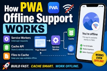
What I felt after testing minimal-ui and browser
In PWA LAB, I also tested display modes other than fullscreen.
minimal-ui can show a small amount of browser UI on desktop, such as back and reload buttons.
But on Android and iPhone, I did not feel a major difference.
browser can even remove the page from being treated as an install candidate in some cases.
So if you want users to use the page as a PWA, it is easiest to think mainly in terms of standalone or fullscreen.
What I learned from testing
The biggest lesson from this comparison was that the same manifest can look very different on iPhone and Android.
Android reflects manifest settings in a much more visible way.
Settings like display, theme_color, and orientation are easier to test and compare.
iPhone, on the other hand, is much more unique.
You can add a site to the home screen, but it is safer to think of iPhone Safari behavior as something different from Android Chrome’s PWA behavior.
For PWAs, what matters is not only “what the specification allows.”
What matters more is how it actually appears on the device in front of you.
Conclusion: standalone is the practical default, fullscreen is useful for Android-focused cases
display: fullscreen has a strong effect on Android.
It reduces the browser feeling and makes the PWA look much more like an app.
However, you should not expect the same kind of change on iPhone.
So if you are targeting both iPhone and Android, display: standalone is usually the most practical default.
For Android-focused experiments, game-like screens, or presentation-style pages, fullscreen is worth considering.
But for general PWAs and home screen tools, using standalone and keeping the experience stable is usually easier for users.
Related articles
If you want to start from the basics, read What Is a PWA? A Simple Explanation of How Websites Become App-Like on Smartphones.
If you want to understand the setup process including manifest.json and Service Worker, read How to Build a PWA: manifest.json, Service Worker, and Home Screen Support.
If you are interested in iPhone behavior, Safari PWA Limitations: What Works and What Does Not is also closely related.
Summary
display: fullscreen is a powerful display mode, just as the name suggests.
On Android, it can become close to a full-screen app experience and strongly increase the app-like feeling.
But on iPhone, there is almost no visible change, so you cannot use it with the same expectations as Android.
For practical use, standalone should usually be the default.
Only consider fullscreen when you specifically want to build a full-screen Android experience.
That distance from fullscreen feels like the most realistic approach for now.