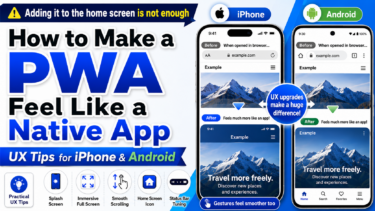
A PWA is a way to add a website to a smartphone home screen and use it more like an app.
But once you actually build one, you quickly notice something important.
Being addable to the home screen does not automatically make it feel like a real app.
A white flash appears right after tapping the icon. The top bar still feels browser-like. The scroll behavior feels like a web page. The back behavior suddenly reminds the user of Safari or Chrome.
When these small awkward moments pile up, users unconsciously feel, “This is not really an app. It is a website.”
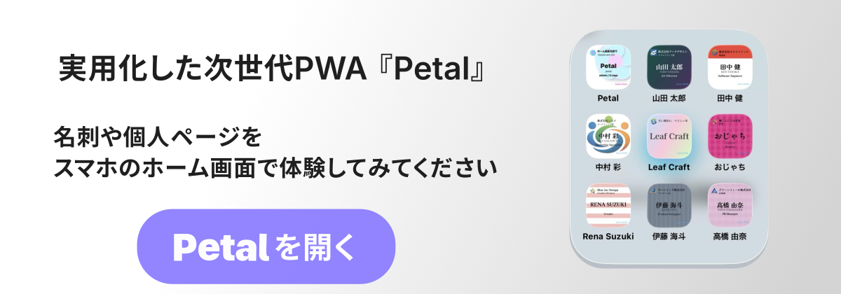
While building PWA LAB, OJapp, and Petal, I tested Add to Home Screen behavior many times on both iPhone and Android.
What I learned is this: to make a PWA feel closer to a native app, flashy features matter less than small details like launch behavior, spacing, colors, scrolling, and back navigation.
In this article, I will organize practical UX improvements for making a PWA feel more app-like based on real device behavior.
- 1 First: PWAs look different on iPhone and Android
- 2 1. Reduce the white screen at launch
- 3 2. Use theme-color to blend system UI
- 4 3. Use safe-area to fix awkward edges
- 5 4. Use 100dvh instead of 100vh
- 6 5. Reduce excessive scroll bounce
- 7 6. Disable unnecessary text selection and long-press menus
- 8 7. Give instant feedback on tap
- 9 8. Do not treat back navigation casually
- 10 9. Detect display-mode and change UI only in PWA mode
- 11 10. Think about any maskable icons
- 12 11. Treat cache updates as part of UX
- 13 Summary: making a PWA feel native means removing small awkward moments
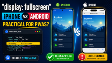
First: PWAs look different on iPhone and Android
Many PWA guides say that once a site is added to the home screen, it looks like an app.
That is not wrong.
But it does not mean iPhone and Android behave the same way.
Android Chrome tends to reflect manifest.json settings clearly.
Settings like display, theme_color, background_color, and icons can visibly affect the experience.
iPhone Safari, on the other hand, can add a site to the home screen, but it does not always reflect manifest settings as directly as Android.
In particular, settings like display: fullscreen and orientation may work on Android but not behave as expected on iPhone.
So when designing PWA UX, it helps to start with this mindset:
On Android, use the manifest to create the app-like feeling. On iPhone, reduce awkwardness through HTML and CSS.
Once you separate those two approaches, the design becomes much easier to manage.
1. Reduce the white screen at launch
The first moment after launch is where a PWA can lose its app-like feeling most easily.
If the user taps the icon and sees a pure white screen, it immediately feels like a web page loading.
In the past, many guides recommended carefully defining apple-touch-startup-image for iOS.
But I do not recommend making that the center of a modern PWA strategy.
Managing startup images for every device is heavy, hard to maintain, and not a very universal solution anymore.
Instead, it is more realistic to focus on these three things first:
- Match
background_colorwith the app background - Match
theme_colorwith the top area color - Keep the initial HTML/CSS render as light as possible
In manifest.json, you can write something like this:
{
 "name": "My PWA",
 "short_name": "My PWA",
 "start_url": ".",
 "display": "standalone",
 "background_color": "#f7f7f7",
 "theme_color": "#f7f7f7",
 "icons": [
 {
 "src": "/icon.png",
 "sizes": "512x512",
 "type": "image/png",
 "purpose": "any maskable"
 }
 ]
}
The important point is to avoid a mismatch between the color shown immediately after launch and the actual page background.
For example, if the manifest background_color is white but the actual page design is dark, the app may flash white for a moment at startup.
That tiny flash can feel surprisingly web-like.
Instead of hiding the problem with splash images, it is more stable to align the background color and initial render from the beginning.
👉 The Limits of Local Storage: Capacity, Deletion Timing, and Safety Explained
2. Use theme-color to blend system UI
If you want to improve the visual quality of a PWA, theme-color is important.
On Android especially, it affects the color of the top bar.
When the page background, header, and theme-color match, the whole screen feels more like one unified app.
<meta name="theme-color" content="#f7f7f7">It is also safer to include it in manifest.json.
{
 "theme_color": "#f7f7f7",
 "background_color": "#f7f7f7"
}
For a service like Petal, where the soft atmosphere matters, a top bar that looks too black, too white, or visually disconnected can break the mood.
On the other hand, when the background, header, and theme color naturally connect, the PWA feels much more app-like.
However, on iPhone, theme-color may not appear as clearly as it does on Android.
That is why the practical approach is to use the manifest well on Android, while reducing visual discomfort through spacing and background design on iPhone.
3. Use safe-area to fix awkward edges
To make a smartphone UI feel app-like, the edges of the screen matter a lot.
On iPhone especially, there are notches and the home indicator.
If you ignore them, the top can feel too cramped, or bottom buttons can sit too close to the home bar. That immediately makes the page feel less native.
This is where env(safe-area-inset-*) helps.
.app-shell {
 min-height: 100dvh;
 padding-top: env(safe-area-inset-top);
 padding-bottom: env(safe-area-inset-bottom);
}
If you have a fixed footer, add extra space at the bottom.
.bottom-nav {
 padding-bottom: calc(12px + env(safe-area-inset-bottom));
}
Even this small adjustment makes the UI feel much more intentionally designed for smartphones.
A PWA is still the Web, but when it is opened from the home screen, users touch it as if it were an app.
So it is better to think in terms of app spacing, not just web page spacing.
4. Use 100dvh instead of 100vh
One common trap in full-screen mobile UI is 100vh.
It may work fine on desktop, but on mobile browsers, the address bar and bottom bar can cause height shifts.
For PWA and Add to Home Screen UI, 100dvh is often more stable.
.app-shell {
 min-height: 100dvh;
}
This matters especially for onboarding screens, splash-like first screens, and fixed-footer layouts.
A bottom button may become slightly hidden. A screen that should not scroll may wiggle slightly. These small layout problems create real stress for users.
App-like quality is not decided by flashy design. It is often decided by the absence of strange shifts.
5. Reduce excessive scroll bounce
One movement that easily feels web-like is excessive scroll bounce.
When the user pulls the screen too far up or down and the whole page stretches, or the background appears, the experience can feel more like a web page than an app.
You cannot always remove it completely, but CSS can control it to some extent.
html,
body {
 overscroll-behavior-y: none;
}
However, killing scroll behavior everywhere is dangerous.
For article pages and long settings screens, natural scrolling is more important.
If you use this, apply it only to app-like screens.
.app-screen {
 overscroll-behavior: contain;
}
For one-screen UIs such as Petal onboarding or digital card screens, this difference can be very effective.
6. Disable unnecessary text selection and long-press menus
When tapping buttons or tabs, if text gets selected or a long-press menu appears, the UI instantly feels more like a website.
For app-style UI parts, disabling text selection can improve the touch feel.
.app-ui,
.app-ui button,
.app-ui a {
 -webkit-user-select: none;
 user-select: none;
 -webkit-touch-callout: none;
}
But do not disable selection for all text.
If users cannot copy text they actually want to copy, the experience becomes worse.
It is enough to apply this only to operation parts such as buttons, navigation, and card UI.
7. Give instant feedback on tap
Native-app-like quality also appears at the moment of touch.
Web links sometimes wait for a moment without any visible response.
When that happens, users may wonder whether the tap worked.
Adding a slight press effect or opacity change to buttons can make the UI feel much better.
.app-button {
 transition: transform 0.12s ease, opacity 0.12s ease;
}

.app-button:active {
 transform: scale(0.98);
 opacity: 0.75;
}
You do not need to overdo it.
The important thing is that the UI responds immediately when touched.
Sometimes, app-like quality is felt more through response speed than visual design.
8. Do not treat back navigation casually
Back navigation is surprisingly important in PWAs.
When a PWA is opened from the home screen, the browser back button may not be obvious.
So you need to provide a back route inside the screen, or design the flow so users do not get lost.
This is especially important for onboarding, settings screens, and detail pages.
- Place a back button inside the UI
- Provide a close button
- Create a route back to the top page
- Decide where to send users when there is no history
On the Web, we often leave this to the browser.
But in a PWA, users treat the experience like an app.
That is why back navigation should be designed as part of the UI.
9. Detect display-mode and change UI only in PWA mode
A PWA can look different when opened in a browser and when opened from the home screen.
So it is useful to detect display mode and adjust the UI only when running as a PWA.
const isPWA =
 window.matchMedia("(display-mode: standalone)").matches ||
 window.navigator.standalone === true;

if (isPWA) {
 document.documentElement.classList.add("is-pwa");
}
For example, you can show an “Add to Home Screen” button only in the browser, and hide it when opened as a PWA.
You can also adjust spacing or headers only in PWA mode.
.is-pwa .install-guide {
 display: none;
}
This is a small detail, but very practical.
People viewing the page in a browser and people opening it from the home screen need different guidance.
If you want a PWA to seriously feel like an app, you should separate those states.
10. Think about any maskable icons
The impression of a home screen app is strongly affected by its icon.
On Android especially, maskable icon handling matters.
However, if you only specify purpose: "maskable", behavior can become unexpected depending on the environment.
In my testing, using any maskable felt more stable.
{
 "src": "/icon.png",
 "sizes": "512x512",
 "type": "image/png",
 "purpose": "any maskable"
}
Also, on iPhone, apple-touch-icon can have strong priority.
For a single fixed web app, that may not be a problem.
But for services like OJapp or Petal, where icons may change per page or per user, a fixed apple-touch-icon can get in the way.
You should pay close attention to the priority relationship between manifest icons and apple-touch-icon.
11. Treat cache updates as part of UX
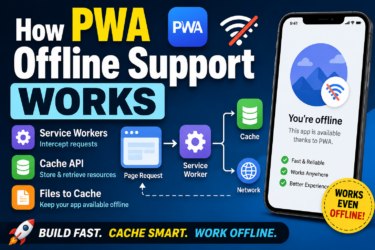
Cache is unavoidable in PWA UX.
With a Service Worker, you can support offline use and faster loading.
But if the settings are wrong, old screens can remain for too long.
From the user’s point of view, that is just a bug.
As developers, we may understand that “it is just cached,” but users do not care.
So in PWA development, cache strategy is part of UX.
- Use Cache First for tools that rarely change
- Use Network First when fresh information matters
- Use Stale While Revalidate when you want fast display with background updates
During development, especially when adjusting visuals and icons, cache can become a serious trap.
In PWA LAB, I also lost a lot of time because manifests and icons I had fixed did not update as expected.
To make a PWA feel app-like, you need to design not only the surface UI, but also how updates reach the user.
For more detail on cache design, read PWA Cache Strategies.
Summary: making a PWA feel native means removing small awkward moments
There is no special magic that makes a PWA look like a native app.
What matters is reducing the small uncomfortable moments users feel when they touch it.
- Reduce the white flash at startup
- Match
theme-colorwith the background - Respect
safe-area - Use
100dvhto reduce height issues - Control unnecessary scroll and text selection
- Add tap feedback
- Design back navigation
- Change UI only in PWA mode when needed
- Pay attention to icons and cache
A PWA is not magic that turns the Web into a native app.
But it can get very close.
On Android, just polishing the manifest can already create a strong app-like feeling.
On iPhone, because there are more limitations, it is more important to reduce awkwardness with CSS and screen design.
In other words, improving PWA UX is not really about hiding the fact that it is Web.
It is about shaping the Web into something that feels natural to use.
Once you reach that point, the technical name no longer matters to the user.
It simply becomes a small, natural entrance sitting on the home screen.