- 1 Home Screen Design Guide: Best Image Sizes for Icons, Wallpapers, and Widgets (Made on Your Phone)
- 1.1 1. Best Image Size for Home Screen Icons (Web Icons)
- 1.2 2. Best Wallpaper Sizes for iPhone (Lock Screen / Home Screen)
- 1.3 3. Best Image Sizes for Widget Designs
- 1.4 4. Useful Aspect Ratios for SNS Posting
- 1.5 5. Recommended Sizes When Using OJapp Tools
- 1.6 Conclusion: You Can Design a Full Home Screen Using Only Your Phone
Home Screen Design Guide: Best Image Sizes for Icons, Wallpapers, and Widgets (Made on Your Phone)
If you want to make your iPhone or Android home screen look beautiful,
knowing the optimal image sizes makes everything cleaner and easier.
Wallpapers, icons, widgets — each element has a recommended image size
that prevents distortion and keeps your layout consistent.
This guide summarizes the essential image sizes
for anyone designing a home screen directly on their phone.
1. Best Image Size for Home Screen Icons (Web Icons)
When saving a web icon (WebClip) to your home screen, use:
- 1024 × 1024 px (recommended)
- PNG format (transparent background allowed)
- No need for rounded corners — iPhone applies them automatically
The 1024px size ensures crisp visuals on both iPhone and Android.
OJapp also uses this size as the default for icon generation.
Note:
White backgrounds + thin lines may appear faint when shrunk.
High contrast and clear shapes are safer.
2. Best Wallpaper Sizes for iPhone (Lock Screen / Home Screen)
Modern iPhones use high-resolution wallpapers. Examples:
- 1290 × 2796 px (iPhone 15 Pro Max)
- 1179 × 2556 px (iPhone 15 / 15 Pro)
Even if you create an image that perfectly matches the device resolution,
iPhone will crop the top and bottom slightly due to:
- Parallax effect
- Safe area adjustments
- Home screen layout margins
To avoid unwanted cropping:
- Leave breathing room on left and right
- Place important elements slightly lower
- Keep text near the center area
To check composition safely, split your wallpaper using
OJapp Splitter → 3:4 mode.
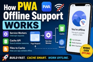
👉 How to Build a PWA: A Beginner-Friendly Guide to manifest.json, Service Workers, and Home Screen Setup
3. Best Image Sizes for Widget Designs
Widget sizes differ by app,
but the following are widely accepted safe resolutions:
■ iPhone Widget Sizes (Common Image Widgets)
- Small: 510 × 510 px
- Medium: 1090 × 510 px
- Large: 1090 × 1140 px
Ratio-wise:
- Small → Square
- Medium → Wide rectangle (approx. 2:1)
- Large → Tall square-like shape
Designing in Square or 3:4 format first makes resizing easier.
4. Useful Aspect Ratios for SNS Posting
These ratios are easiest to edit directly on your phone:
- 1:1 → Instagram grid, profile icons
- 3:4 → Natural for mobile photos
- 9:16 → Reels, Shorts, TikTok
OJapp Splitter focuses on Square and 3:4
because these cover most mobile-oriented layouts.
5. Recommended Sizes When Using OJapp Tools
If you’re designing your home screen entirely on your phone, follow this rule:
- Icons → 1024 × 1024 px
- Wallpaper composition → Check using 3:4 splits
- SNS feed layout → Split into square tiles
Since Splitter uses fixed ratios,
you never have to worry about “which size should I choose?”
Conclusion: You Can Design a Full Home Screen Using Only Your Phone
Designing a beautiful home screen isn’t about complex apps —
knowing the correct image sizes is the real key.
With the right dimensions for icons, wallpapers, widgets, and SNS posts,
you can build a clean, unified home screen with nothing but a smartphone.
👉 Use OJapp Splitter to prepare your images