When someone adds a website to their home screen, its icon can look like an awkward browser shortcut—or like an app that has always belonged there. The difference often comes down to a few lines of configuration and careful visual design.
1. Give the app an identity with manifest.json
A Web App Manifest defines the name, launch behavior, display mode, and icons of a web app. It is more than a technical checklist: it tells the operating system how to present your website on the home screen.
{
  "name": "My Web App",
  "short_name": "My App",
  "start_url": ".",
  "display": "standalone",
  "icons": [{ "src": "/icon-512.png", "sizes": "512x512", "type": "image/png", "purpose": "any maskable" }]
}
For Android, consider the safe area used when the launcher crops a maskable icon. A design that fills the entire square may lose important details when displayed as a circle or another shape.
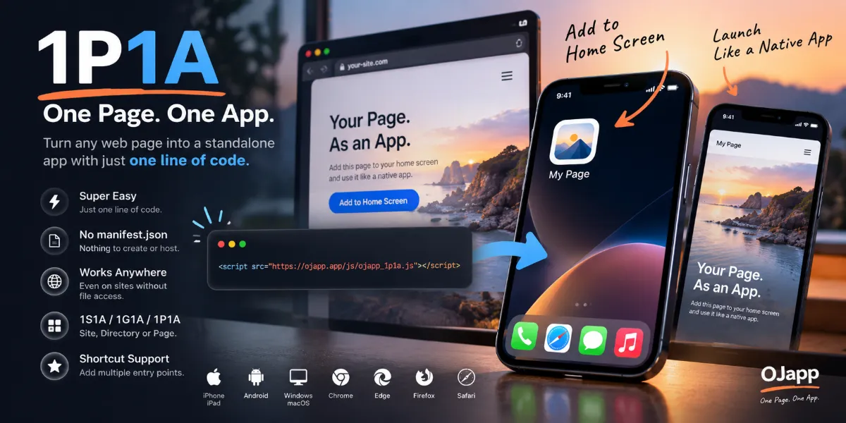
2. Don't forget iPhone users and apple-touch-icon
Safari on iPhone may use apple-touch-icon when creating a home screen icon. That means a perfectly configured Manifest does not necessarily guarantee that iOS will choose the image you expect.
<link rel="apple-touch-icon" href="/icon-ios.png">For a fixed brand icon, supplying an appropriate iOS image is often useful. For pages with dynamically selected icons, however, an old or shared apple-touch-icon can override the intended page-specific design. Check the actual result on the device.
3. Design for the user's home screen, not just your website
Think about the icon alongside the apps already on the user's phone. Is the symbol recognizable at a small size? Is the contrast strong enough? Does the background feel intentional? Avoid packing tiny text into a square that will be reduced to a few dozen pixels.
The goal is not simply to reproduce a website logo. It is to make an icon that people are happy to keep on their personal home screen.
4. Adding to the home screen is a distinct experience
A bookmark lives inside the browser. A home screen icon occupies the same personal space as native apps. That changes the design brief: the name, image, and destination all matter.
A PWA icon succeeds when it is recognizable, attractive, and opens exactly what the user expected. Those small details turn a technical installation feature into a useful everyday shortcut.